Table of Contents
- 1. What LinkedIn is changing
- 2. The menu shuffle is cosmetic. The fold is not
- 3. The fold was a tactic, and the tactic just defused itself
- 4. What to do now
- 5. The bigger picture: feeds are converging on reading time
- 6. Frequently asked questions
- 6.1. Is everyone seeing LinkedIn's new layout and longer previews?
- 6.2. Do "see more" clicks still matter for reach?
- 6.3. Should I write shorter posts now?
Short on time? LinkedIn is testing longer text previews in the feed: readers now see more of your post before the "see more" link, as part of a wider navigation cleanup reported on October 27, 2026. That moves the audition zone. The feed has measured how long people linger on a post since 2020, and a bigger preview puts more of your writing inside that measured window. The one-line cliffhanger built to farm "see more" clicks loses its mechanics, because the lines it used to hide are now sitting in plain view. Your opening three or four sentences have to carry substance, not just bait.
What LinkedIn is changing
Social Media Today's Andrew Hutchinson reported the test on October 27, 2026. Most of it is housekeeping. On desktop, LinkedIn has consolidated its menus into fewer listings: the Profile tab now holds your analytics, saved posts and settings, and a new More tab collects puzzle games, news, groups, events, newsletters and video. Mobile gets the same consolidation in the lower bar. LinkedIn says the test rolls out gradually and varies by region and language, so you may see none of it yet.
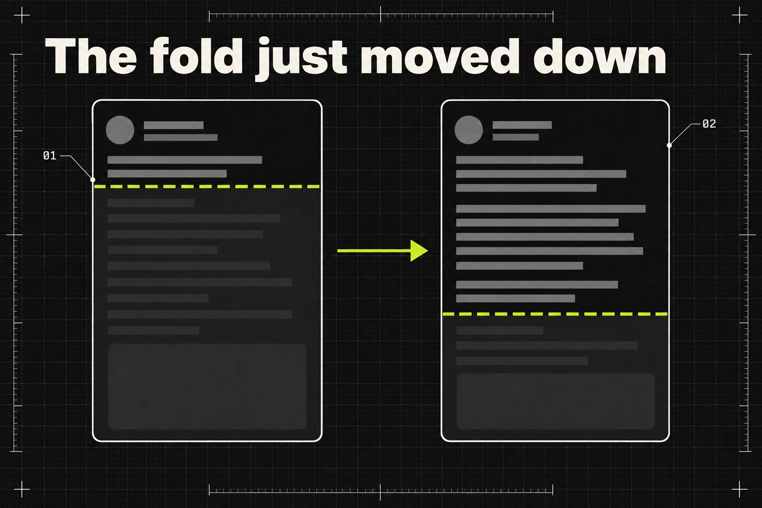
Buried under the menu news is the line that matters for anyone who grows by posting: LinkedIn is showing longer clips of text posts in the main feed before readers hit the "more" link. Hutchinson notes this could help creators keep people reading, and could force a rethink of posts that used the cutoff to hide their text.
The menu shuffle is cosmetic. The fold is not
Where the games tab lives changes nothing about your reach. Where the fold sits changes how your post gets judged, because of a metric LinkedIn documented years ago and most posting advice still ignores.
Since 2020, LinkedIn's feed ranking has measured dwell time, in two forms. There is dwell time "on the feed," which its engineers say "starts measuring when at least half of a feed update is visible as a member scrolls," and dwell time "after the click," the time spent once someone expands or opens the content. The team built this because clicks are noisy. Their own write-up describes "click bounces": someone opens a post, realises within seconds it is not for them, and backs out. A click happened; no interest did. Time spent reading is harder to fake, so the feed trusts it more.
Follow that through. Most of your readers never click, react or comment. They are scored by how long they hold on your post as it sits in the feed, and the preview is the only part of it they can hold on. Make the preview longer and more of your actual writing falls inside the measured zone. A reader who gets four sentences in before scrolling past just gave LinkedIn a stronger signal about your post than the old two-line preview ever could, in either direction.
The fold was a tactic, and the tactic just defused itself
For years, the cutoff was something you engineered around. The classic version was "broetry": one line, a blank line, another line, stretched down the screen so the fold landed mid-tension and curiosity did the clicking. LinkedIn never liked it. When Ryan Roslansky was announced as incoming CEO in 2020, Social Media Today noted that he had already said he disliked those posts, and dwell time was partly a response, since a format that wins clicks but loses readers shows up immediately in the numbers. Hutchinson's view in this week's piece is that the platform has mostly been rid of line-by-line posts for a while.
The softer version of the trick survived, though. Plenty of people still write a first line whose only job is to get the "see more" tap: the unfinished story, the number with no context, the confession cut off mid-sentence. A longer preview strips that move of its mechanics. If the payoff is visible without a click, the tease is just a weak opening followed by its own spoiler. And the judgment it faces got stricter this month for a second reason: LinkedIn's editorial VP said in a Forbes interview that readers decide in the first two sentences whether a post says anything new, a standard we unpacked in our breakdown of the no-banned-words interview. More visible text means more material for that first-two-sentences judgment, from readers and classifiers alike.
This is good news if you write substance and mildly bad news if you write bait. A post that opens with a real number, a real client moment or a position worth arguing with now gets more of itself seen before the scroll decision. A post built as a delivery vehicle for one withheld reveal now shows the reveal up front.
What to do now
Four moves, in order of urgency.
- This week: reread your last ten posts as previews. Look at the first three or four sentences of each and ask whether they would survive being the whole visible post. If sentence one is a tease and sentences two through four are wind-up, you have been renting reach from a fold that is moving.
- This week: move one concrete thing into every opening. A number, a named situation, a claim someone could disagree with. The preview is now the post for most readers, so the preview has to contain the value, not advertise it.
- This month: retire any format that depends on the cutoff. If a template in your rotation hides its point below the fold on purpose, it was built for mechanics LinkedIn is testing its way out of.
- This month: check your analytics while you are at it. In the test layout they sit one click away under the Profile tab, and reading time rewards are exactly the kind of shift you can only confirm in your own numbers, not in anyone's think piece.
Two things not to do. Do not rebuild your whole content system for a test you may not even be in yet; LinkedIn itself says the rollout is gradual and varies by region. And do not conclude that hooks stopped mattering. The first line still decides whether anyone reads sentence two. What changed is that the first line no longer gets to do the job alone.
The bigger picture: feeds are converging on reading time
LinkedIn is not doing this in a vacuum. X spent October retuning its algorithm around time spent on a post rather than raw likes and reposts, a change we covered in our piece on X ranking by read time, and the logic is identical: engagement counts are gameable, held attention less so. LinkedIn's dwell-time write-up closes with the line that they believe "time well spent is better than more time spent," and a longer preview is that belief applied to the feed's front door. It also lands alongside the Network and For You tab test, which splits the feed itself. The platform is reworking both what you see and how long it watches you see it. Writers who hold attention for honest reasons come out ahead on every one of those changes.
Frequently asked questions
Is everyone seeing LinkedIn's new layout and longer previews?
No. LinkedIn says the new navigation experience is being tested gradually, with elements varying by region and language, so many accounts will not see the changes yet. The longer text previews are part of the same experimentation, reported by Social Media Today on October 27, 2026.
Do "see more" clicks still matter for reach?
Clicks still feed the ranking, but LinkedIn added dwell time to its feed algorithm in 2020 precisely because clicks are noisy. Its engineers describe "click bounces," where someone opens a post and leaves within seconds. Time spent reading, in the feed and after the click, is the steadier signal, and a longer preview enlarges the in-feed part.
Should I write shorter posts now?
Length is not the variable; the opening is. A long post whose first four sentences earn attention benefits from a bigger preview. What loses out is any post, long or short, whose visible lines exist only to manufacture a click rather than deliver something.
The bottom line: as of October 2026, LinkedIn is testing a feed that shows more of your writing before anyone taps "see more," on a platform that has scored reading time since 2020. The fold was never a finish line, but plenty of posts were written as if it were. Write openings that survive being read in full, because that is now, literally, how they will be read.